Neuroaesthetics Meets Interior Design: An Evidence-Informed Method for Luxury Hotel Art Curation
Why innovate now (and always)
In hyper-competitive hospitality, staying at the top means relentless innovation. At Wood & Slate, our growth mindset keeps us opening our minds to disciplines that make spaces both more beautiful and more effective. Neuroaesthetics—the science of how aesthetic experiences shape attention, emotion, and stress—has become one of our most powerful tools.[1]
The Ritz-Carlton lens: customer experience as the north star
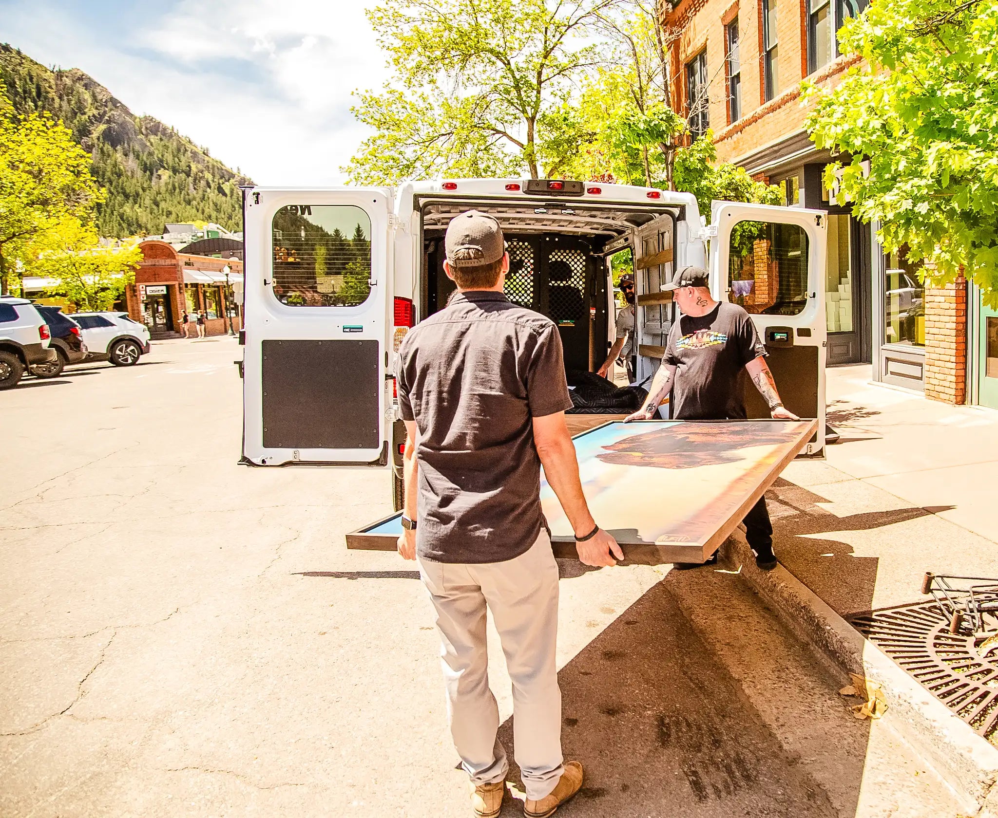
At The Ritz-Carlton, the Gold Standards are built around one outcome: memorable guest experiences, reflected in guest satisfaction and engagement. As Horst Schulze writes in Excellence Wins, service excellence is the north star—financial results follow. Our approach pairs neuroaesthetics with classic interior design concepts—elements, principles, and functions—to intentionally shape how guests feel in a space: effortless welcome, restorative calm, and place-specific wonder. When neuroscience guides choices in materials, light, color, placement, and subject matter, customer experience improves by design—not by chance. Ritz operationalizes guest experience through empowered action, as evidenced by their widely cited $2,000 policy. We operationalize guest experience through curated, site-specific artwork.

What sets Wood & Slate's natural-material prints apart
Most "prints on wood" are treated like graphics applied to a surface. Ours marry museum-grade print standards with heirloom-grade craftsmanship—resulting in luxury wood artworks finished to gallery expectations.
Baltic birch, curated and finished: We hand-select panels for grain character and alignment, then manufacture to tight tolerances and finish with softened edges and a satin, touch-friendly sheen. The result isn't just a print; it's a crafted object with presence.
A year in R&D: our exclusive leather substrate: We spent over a year developing a custom, print-grade leather specifically for image fidelity and tonal depth. This leather is exclusive to Wood & Slate—delivering a quiet, matte elegance and remarkable tonal subtlety that standard materials can't match.
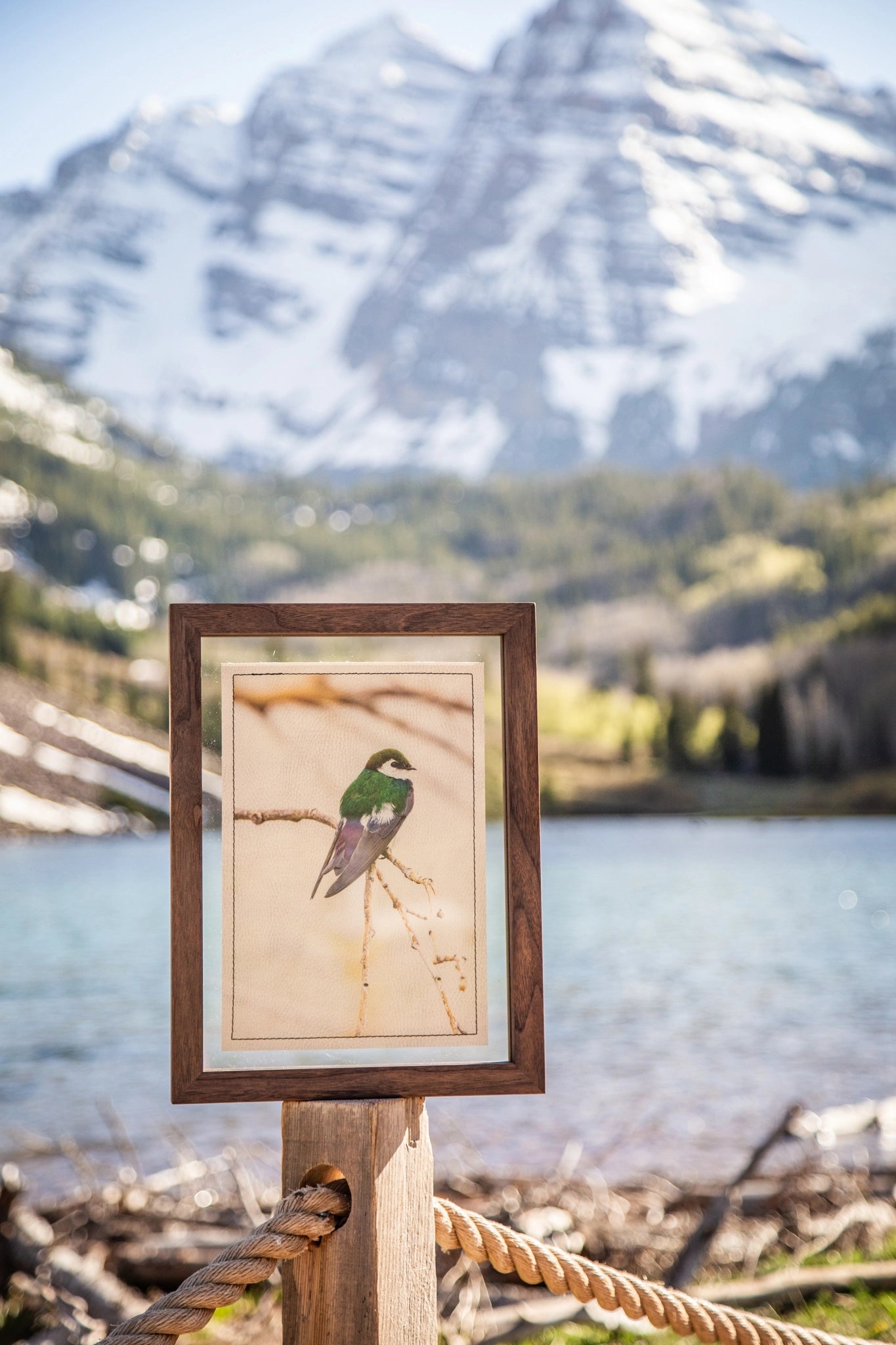
True Color Printing Technology™: Our proprietary color and print process—built for substrate-specific optimization—delivers photographic-quality resolution and dimensional presence on natural materials, so details settle into the surface rather than floating above it.
Together, these choices create multisensory, natural-material art that reads as refined, intentional, and truly luxury-grade.
The premise: design that feels good and works hard
Neuroaesthetics shows that material, color, light, texture, and the subject of the image can measurably shift physiology and mood.[2] Applied to interiors, this becomes evidence-informed design: every aesthetic decision earns its keep by supporting how people feel and interact in the space—especially in high-expectation environments like luxury hotels.
Subject matters: how imagery shapes guest experience
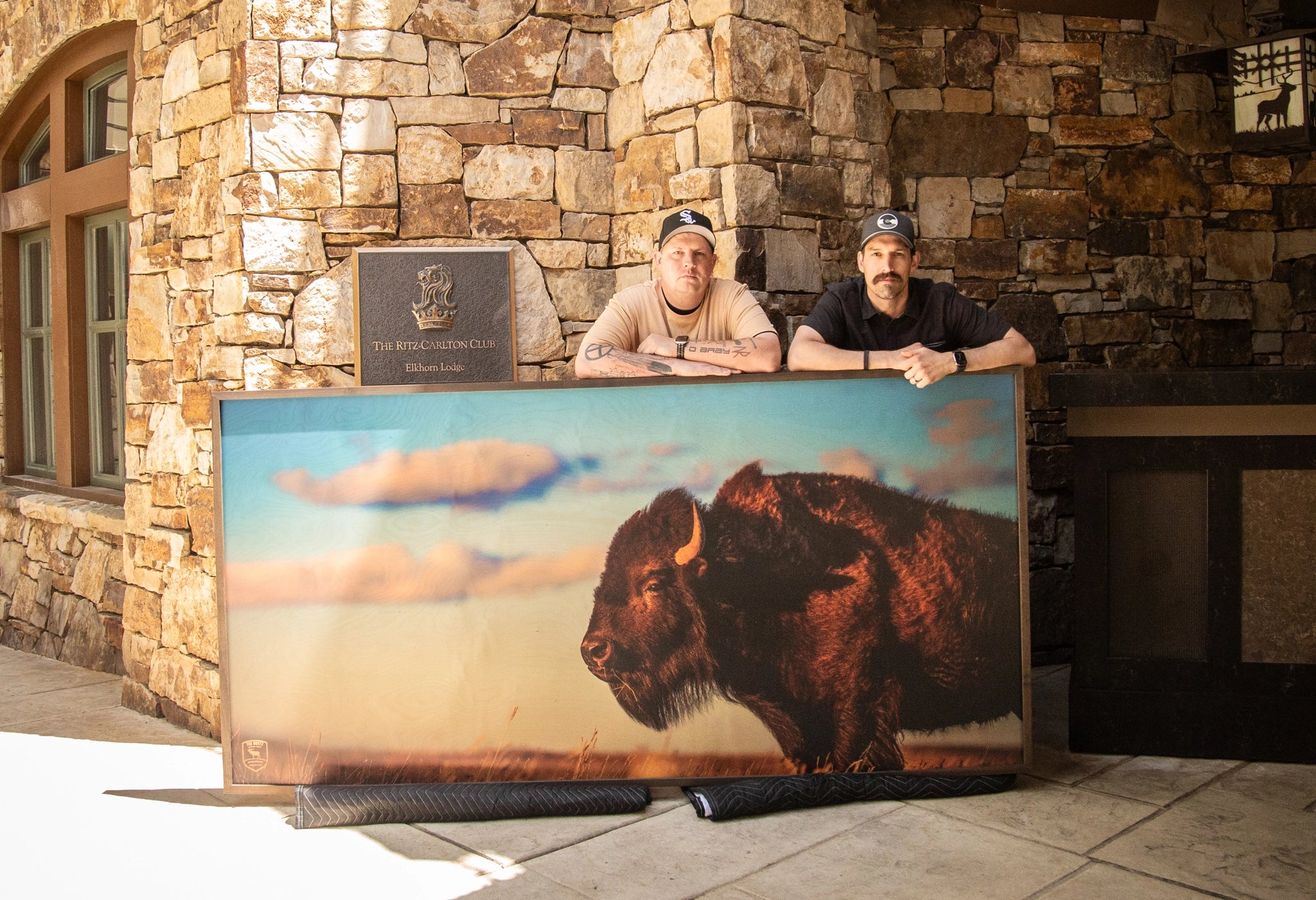
The Rootz at The Ritz-Carlton is a site-specific, property-exclusive collection from the early chapters of Joe Pekara's work—available only at Aspen Highlands. Together we curated a sequence that mirrors Aspen's natural character: alpine horizons on horizontal-grain birch for openness; vertical timberlines on vertical-grain birch for lift; intimate wildlife moments on our custom leather for quiet presence. Because subject and substrate reinforce each other—and True Color preserves micro-detail and tonal nuance—the work reads as high-craft and distinctly Aspen-aligned, supporting The Ritz-Carlton's guest-experience mandate.

We curate around illumination—treating light itself as the subject—favoring golden-hour warmth, alpenglow washes, and blue-hour calm so the work reads true under warm, high-CRI hotel lighting.[3] From there, we prioritize legendary, Aspen-defining subjects—Highlands ridgelines, Maroon Bells silhouettes, and quaking aspen groves—rendered on birch or leather with museum-grade fidelity.
Landscapes (horizons & vistas): Wide horizons and gentle perspective lines cue spaciousness and ease. On birch, horizontal grain can echo the horizon, creating subtle coherence guests describe as "calming" and "open."

Forests & vertical forms: Trees and ridgelines introduce an upright cadence that feels grounded yet uplifting. On vertical-grain birch, those lines harmonize with the substrate, heightening dimensional stability.
Water & soft movement: Streams and waterfalls suggest gentle motion; printed via True Color onto birch, mid-frequency detail (spray, ripples) locks into the grain, enhancing felt realism and encouraging viewers to linger.
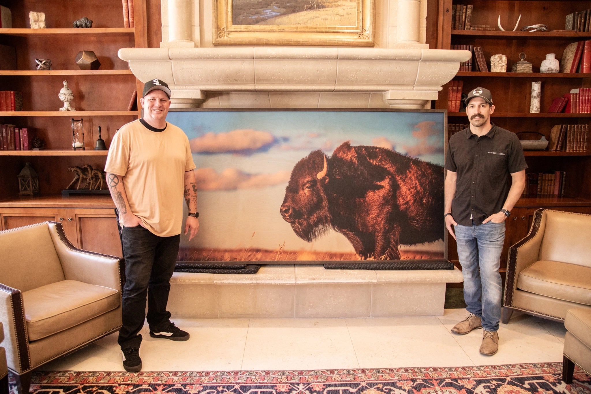
Wildlife (connection & presence): Select portraits—especially with clear gaze direction—foster a spark of connection. On leather, the matte surface calms highlights around eyes and fur, deepening tone and intimacy.
Time-of-day palettes: Dawn and golden-hour scenes bring warm, inviting palettes that translate to a welcoming social mood in lounges and dining spaces.
Sense of place: Curating Rocky Mountain motifs—peaks, pines, alpine meadows—reinforces Aspen's identity, making the art not just luxurious, but location-true and personally meaningful.
Takeaway: Subject selection is a performance variable, not just a style choice. When subject, substrate, and color science align, the work feels quietly powerful—raising perceived quality and deepening the emotional memory of the stay.
Our method: align four neuro principles with classic design moves
1) Neuroplasticity → repeated cues
Small, repeated exposures help the brain stabilize patterns of attention and emotion over time—especially when those exposures are consistent and "easy to process." In a hotel, that means guests don't need a single dramatic art moment to feel the space; they benefit from repeated, coherent signals that gently reinforce the property's emotional tone (welcome → ease → restoration). We apply this by creating a cadence of thoughtfully scaled works at thresholds and dwell points—lobby approach, elevator lobbies, corridor turns, and lounge entries—so guests receive micro "doses" of calm, orientation, and curiosity throughout the day. In interior-design terms, it's rhythm and repetition; in neural terms, it leverages the brain's tendency to consolidate what it encounters consistently across time.[4]
2) Enriched environments → multisensory layering
"Enriched environments" are settings that provide varied, meaningful sensory input—the kind of complexity the brain tends to find restorative when it's coherent rather than chaotic. In practice, that's not about visual clutter; it's about layered richness: texture, material authenticity, depth, and nature-linked cues that invite the nervous system to downshift. We build this effect through natural substrates (birch grain, leather matte softness), controlled reflectance (low-glare surfaces that prevent "hot spots"), and warm, high-CRI illumination that protects tonal nuance and skin-friendly color. The result is a room that feels more "alive" and tactile—supporting lingering without overstimulation—balancing variety and contrast while avoiding visual noise.[5]
3) The Aesthetic Triad → SENSE × FEEL × MEANING
Neuroaesthetics increasingly describes aesthetic experience as the interaction of three systems: sensory–motor (what the body/visual system registers—texture, edges, luminance), emotion–valuation (what feels rewarding—color harmony, contrast, composition), and meaning–knowledge (what the scene signifies—story, memory, place).[6] This triad maps cleanly to luxury art curation because it prevents "pretty but forgettable." We design for SENSE through material truth—wood grain that carries the eye, leather that absorbs glare, frames that feel substantial. We design for FEEL through tonal control and composition that creates ease rather than tension (especially under real hotel lighting). And we design for MEANING by choosing subject matter that connects to place and identity—Aspen-defining landscapes, wildlife presence, seasonal light—so guests feel not just impressed, but personally oriented in the story of where they are.
4) Default Mode Network → reflection through placement + story
Quiet, meaning-rich art with visual breathing room supports reflective "inner" processing linked to calm and personal relevance. We operationalize this by curating a focal piece for each key zone and providing clear placement guidance—viewing distance, surrounding negative space, and recommended lighting conditions—so the artwork invites pause. Each piece also links to a dedicated landing page where Joe Pekara shares the story behind the image, extending meaning beyond the moment of viewing.[7]
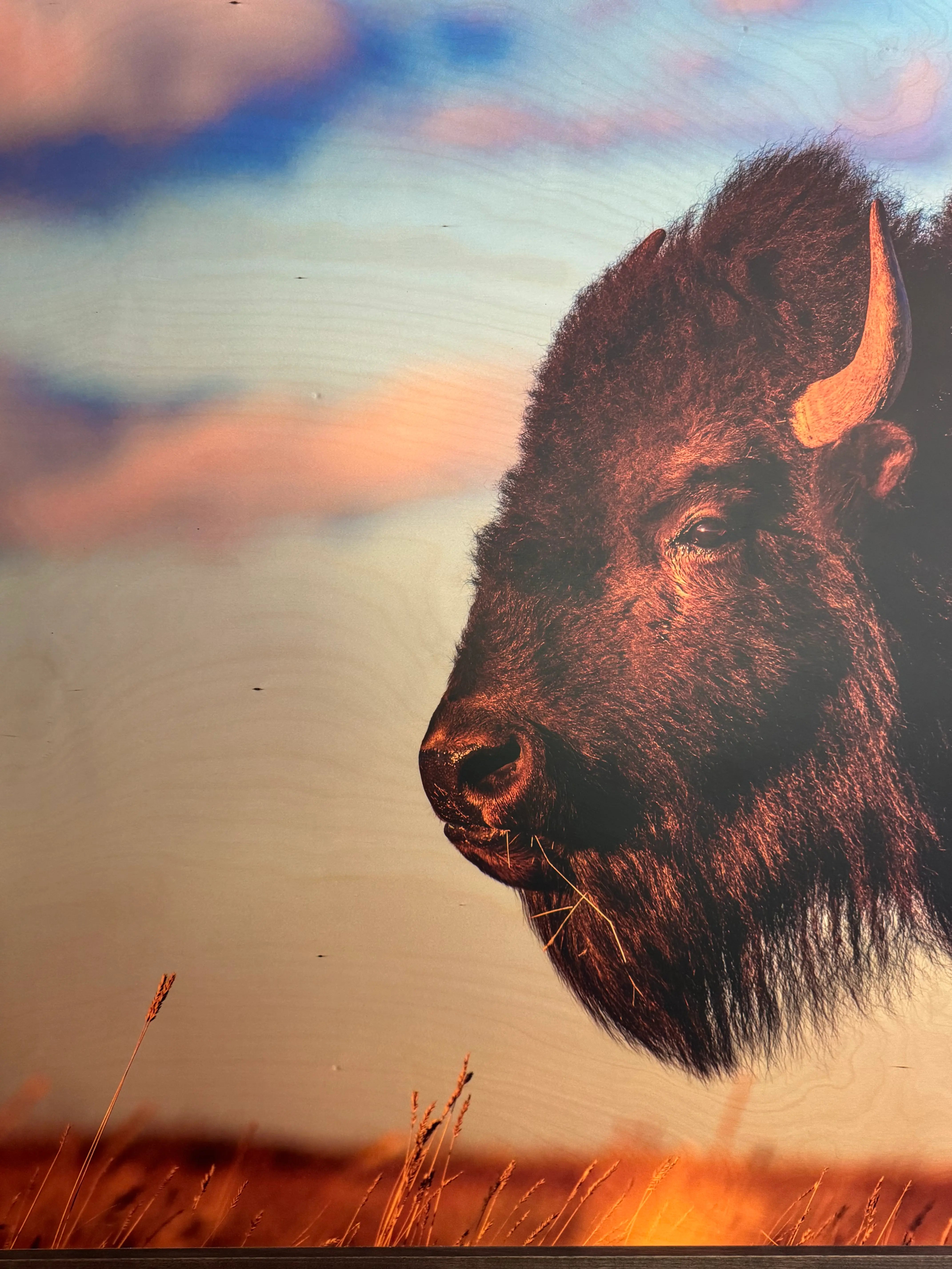
In practice: Wood grain carries the eye and adds tactile depth (SENSE); wildlife presence and gaze create connection (MEANING). This natural-material print exemplifies how substrate and subject work together to support the principles above.
What clients feel
Guests don't say "neuroaesthetics"; they say warm, welcoming, memorable. For operators, we recommend tracking pragmatic proxies: dwell time near focal zones, photo shares, and brief mood pulses pre/post install. When those numbers move in the right direction, the customer-experience mandate is being met.
Work with us
If you're exploring luxury hotel art curation or a Ritz-level refresh in Aspen or beyond, we'll translate neuroscience into beautiful, evidence-informed interiors—from subject curation and natural-material selection to True Color image preparation and placement guides—so your spaces look exquisite and deliver the kind of customer experience that wins in hyper-competitive markets. Because we handle curation, production, and placement guidance in-house, properties can work directly with Wood & Slate without adding layers of coordination.
Endnotes
[1] Magsamen, S., & Ross, I. Your Brain on Art: How the Arts Transform Us (publication details). (PenguinRandomhouse.com)
[2] Ulrich, R.S. et al. (1991). "Stress recovery during exposure to natural and urban environments." Journal of Environmental Psychology. (ScienceDirect)
[3] CIE guidance on colour fidelity/CRI limitations + IES TM-30 discussion of color fidelity as a design intent. (CIE)
[4] Oxford Research Encyclopedia of Education — "Distributed Practice or Spacing Effect" (overview of how spacing/repetition improves retention over time). (Oxford Research Encyclopedias)
[5] Franco, L.S., Shanahan, D.F., & Fuller, R.A. (2017). "A Review of the Benefits of Nature Experiences: More Than Meets the Eye." International Journal of Environmental Research and Public Health. (PMC)
[6] Chatterjee, A. (2014). "Neuroaesthetics." Trends in Cognitive Sciences. (PubMed)
[7] Vessel, E.A., Starr, G.G., & Rubin, N. (2012). "The brain on art: intense aesthetic experience activates the default mode network." Frontiers in Human Neuroscience. (Frontiers)
Recommended Articles

Unique Corporate Gift Ideas: The Total Directional Case Study
Introduction Corporate gifting is more than a gesture—it’s a powerful tool for deepening business relationships and enhancing your brand. In a world of the best corporate gifts and generic gifts, standing out with thoughtful, customized offerings can leave a lasting positive impression on clients and employees alike....
Read More
How Our Luxury Art Installations Elevated the Ritz-Carlton Aspen Highlands
Project Overview: A Vision for Luxury and Art Nestled in the picturesque mountain town of Aspen, The Ritz-Carlton Aspen Highlands is renowned for its refined ambiance and commitment to delivering an exceptional guest experience. When they envisioned elevating their visual identity through curated art, they turned to Wood & Slate to execute a project rooted in elegance, nature, and storytelling....
Read More